
In a past life, I was a teacher of Art. I loved the students (well most of them) and the teaching aspect of the job; it was the politics and paper work that sent me running for the hills. As they say, once a teacher . . . always a teacher. Here are some handy hints for expanding your colouring / drawing techniques. At the end is a glossary of art terms that I have used throughout this article that you might or might not be familiar with.
1) Work from a photo / similar source image
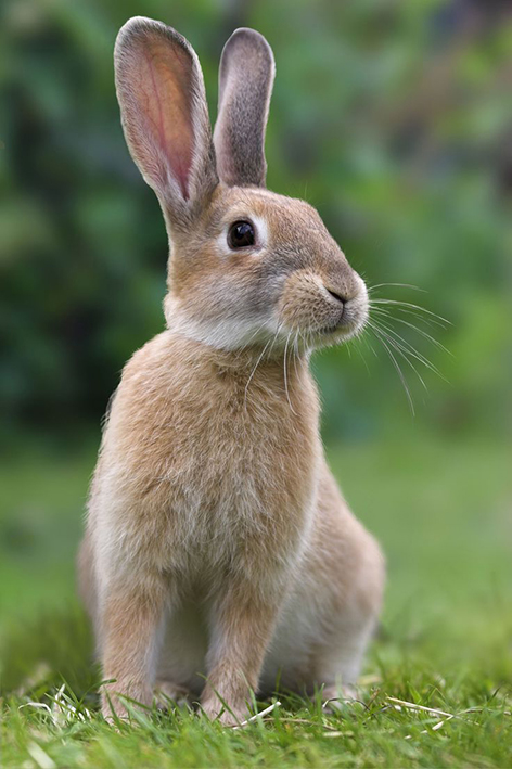
Here is the image that I used as my inspiration for the rabbit in this illustration. If you are wanting your colouring to look slightly realistic, then you want to look to nature for ideas as to the different colours that occur in the object as well as how the different light tones and dark tones work together to make it look 3-dimensional. However if you don’t worry about realism and are happy to have fun with it, ignore this step completely.
2) Decide what technique you want to use to colour
![]()
a) is an example of just moving the pencil across the paper and gradually applying more pressure to it as you move down the page. It is a lovely way to show lighter tones changing into darker.
b) demonstrates a drawing technique called ‘hatching’. It involves diagonal lines, often they will be parallel to each other. It is good to make sure you have a super sharp pencil for this style of rendering. Again here I have changed the pressure I have applied to the pencil, starting from just moving the pencil across the page to then gradually pressing harder as I moved down the page.
c) here I have layered up hatching that is at different angles, this is called ‘cross hatching’. I have used dark indigo and burnt umber, these two colours when blended or layered up together create a lovey black alternative for shading or creating dark tones. The pencils could have been sharper but hey, I was on a roll.
d) again here are dark indigo and burnt umber applied on top of each other. This time I have gone back to using the same style of colouring as I did in a) moving the pencils across the page without applying pressure then ever so gradually pressing harder.
3) Creating richness and depth to your colour work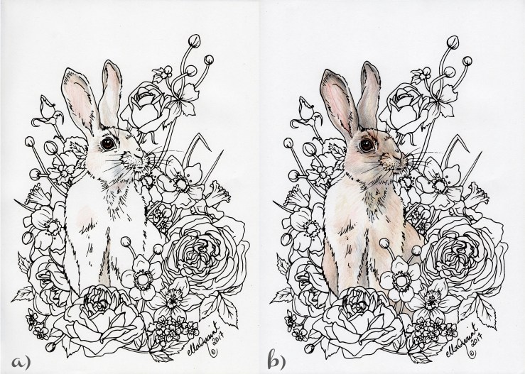
For the purpose of this tutorial, I have exaggerated the colours just a bit so it is easier to see what I am doing. The idea behind this is to layer up colours so that the final product is not just different tones of the same hue. By gradually working up colours into and on top of each other, you can achieve a lovely rich effect that adds vibrancy to your pencil work.
For this demonstration I have used my own design ‘Bunny Bouquet’. Should you find it appealing, you can purchase and download it via my etsy store ellacute. The pencils I love to use are Faber Castell Polychromos. They have an amazing spectrum of hues and layer up beautifully. The colours I have used for colouring the rabbit are;
burnt ochre
raw umber
venetian red
burnt sienna
walnut brown
burnt umber
dark indigo
a) here I have picked out some key colours for base areas starting with the rabbit’s ears. I looked carefully to see what shapes the different areas of colour were. The aim is to gradually layer up colours, not to go hard out straight away. You can always go darker or layer up addional colours later.
Consider carefully too what colours can you see in different parts of an object? The venetian red was delicately added into the inside of the ears where the skin shows through. I also applied it where I saw there was a very subtle rufus tinge to the rabbit’s fur. On the inside edges of the ears I added in walnut brown and dark indigo. Other hues I started layering were burnt ochre and raw umber as they were ideal base colours.
b) this stage shows how I started to precisely layer up different hues into the ears to add detail and tone. The dark indigo, walnut brown and burnt sienna worked wonderfully to create richness and depth into the creases of the ears. Get the form (3-d shape) of the object / area established first, then add the details last.
4) Blending the colours together and adding detail
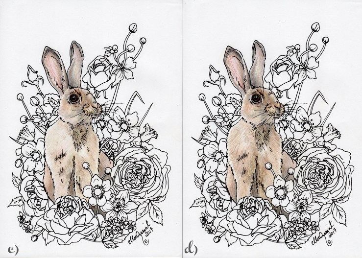
c) here you can see that I continued to layer up different hues onto each other. I aimed to keep the colour usage consistent across the rabbit so that it read together as a cohesive whole. To help that effect, I also very gently layered up colours like the burnt ochre and raw umber over the lighter areas so that they were blended and linked together. Burnt sienna and burnt umber were the key colours that were used to link the darker areas.
d) last but not least, I added in some gestural marks, loose hatching, that went in the same direction as the rabbit’s fur. Look to see what direction it goes in different parts of it’s body. This helped to further the form of the animal, added detail and created the sense that it was indeed furry.
5) Practice and enjoy!
Like developing confidence with anything, practicing is the best way to further your development in using coloured pencils. The mentioned techniques can be applied to drawing from scratch and in some cases painting.
![]()
Why there are more scans than photographs in this article. My little familiar decided that he needed to be the center of attention and that the pencil made an excellent snack.
Do you prefer instructibles / tutorials that are in static form like this or videos?
Glossary
Shape – the 2 dimensional space an object takes up.
Form – the 3 dimensional ‘shape’ of an object. It is usually defined by light tints and dark shadows.
Blending – making the change between one area of colour or tone more subtle. This can be done by rubbing, (with some coloured pencils baby oil). In this tutorial I have suggested doing it by subtly layering up colours and working similar hues on top of each other.
Hatching – a drawing technique that consists of lines that are parallel to each other. When marks like that are overlapped in different directions it is called cross hatching.
Gestural – vigorous application of media, in this case coloured pencil. Gestural pencil / paint work can give a sense of energy and life to an object / art work.
Tone – the lightness or darkness of something. Tone describes form.
Tint – a light version of a colour / hue. Usually white or another super light colour is added to it or it can be achieved by letting the white of the paper show through.
Shadow – the dark version of a colour / hue. Usually black or another darker colour is added to the base colour.
Hue – pure colour. One that does not have white or black added to it. I have used it in a slightly looser sense in this article.

